

Mobile Checkout Optimization: How to Close the Conversion Gap with Desktop
The volume of mobile traffic on the Internet surpassed desktop long ago, yet a lower mobile checkout conversion remains one of the most persistent revenue leaks for online sellers. Across nearly every e-commerce vertical, smartphones bring in the majority of product views and add-to-cart events, only for desktop sessions to generate a disproportionately more predictable and sustainable share of completed orders. The root cause is rarely a lack of buyer intent or hardware capability. Instead, the gap comes down to non-optimal mobile checkout, fragmented buyer attention, and other circumstances surrounding the purchase. Unlike a desktop user who sits comfortably at a desk with a full keyboard and a large screen in front of them, a mobile buyer is often browsing on the go, like riding public transit, walking down a crowded sidewalk, or holding a coffee while navigating with a single thumb. These patterns cannot really be influenced, but creating a solid foundation for effective mobile commerce checkout design is surely possible. In this blog post, we will explain how.
Why mobile checkout abandonment is so much higher than desktop
Multiple industry benchmarks confirm that the drop-off could become really steep once customers move from browsing to paying on a phone. While desktop cart abandonment typically hovers between 66% and 73%, mobile cart abandonment regularly climbs into the 80% to 85% range. It could reach up to 85.65% against 69...73% on desktop, according to Drip (2026).
A revealing parallel appears when comparing mobile websites against dedicated mobile shopping apps. Across 2026 separate researches from Drip, Customcy, and MobiLoud, native mobile shopping apps consistently convert noticeably better than mobile browser storefronts. While the exact lift varies depending on the study's methodology, product niche, and app quality, the directional trend is unmistakable: mobile buyers complete orders when the payment interface removes typing and behaves like a native smartphone tool rather than a shrunken desktop webpage.
Three technical and ergonomic friction points drive mobile browser abandonment:
- Small screens multiply input errors: Typing a card number, expiry date, CVV, email address, and multi-line street address on a virtual touchscreen keyboard is slow and error-prone. Auto-correct may adjust street names, and the on-screen keyboard often covers half the viewport, hiding validation warnings, checkboxes, or navigation elements and buttons.
- Slower load times and unstable connections: Mobile buyers rarely sit on a static fiber optic connection. They are often in motion, and the real-world network handoffs, such as walking out of home Wi-Fi range onto cellular data or passing through a subway dead zone, can cause a slow payment page to time out mid-submission.
- Cramped clickable elements: Links, checkboxes, and form fields spaced for a precision mouse cursor become frustrating obstacles for human thumbs, leading to accidental taps, lost form progress, and immediate exits.
7 mobile checkout optimization tactics that work
Closing the conversion gap requires removing physical and cognitive effort from every step of the payment flow. Below is a practical checklist of mobile checkout best practices drawn from Checkify merchant performance data, as well as own research and observations by our team.
1. Enable express/one-tap payment (Apple Pay, Google Pay)
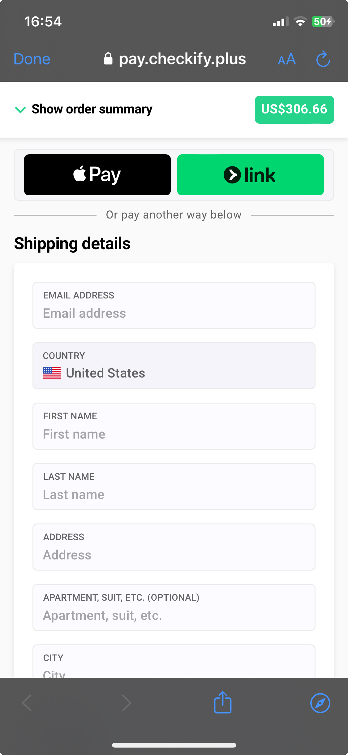
Based on Checkify internal analytics across the payment methods of connected merchants, enabling express payment wallets is the single strongest factor influencing mobile conversion rates. When a buyer taps Apple Pay or Google Pay, the smartphone handles identity verification through face ID or a fingerprint scan and passes pre-saved shipping and card details directly to the payment processor in seconds. Beyond lifting completion rates, accelerated wallets also increase spend per order: according to AppMaker (2026), one-click checkout increases the average cheque of mobile shoppers by 28.5%. Placing wallet buttons at the top of the checkout screen lets high-intent buyers finish paying before environmental distractions interrupt them.
Action: Activate Apple Pay and Google Pay inside your payment gateway settings, position their express buttons above the standard contact form on your checkout page, A/B test the positioning as sometimes it could be wise to place the buttons down the page, for mobile customers. Once set, run a live test order on both iOS and Android devices to confirm instant address transfer.
{{CTA}}
2. Use larger, thumb-friendly buttons
Small interactive targets are one of the fastest ways to frustrate those who shop on smartphones. Research from Dynamic Yield (via MobiLoud, 2026) found that 67% of buyers on mobile devices complain about "very small buttons and link elements" as a major drawback of their buying experience. When a customer tries to tap a shipping radio button or a "Complete order" element, and accidentally hits a small "Terms of Service" link or "Return to Cart" text instead, the resulting page reload often kills the sale. Generous tap targets and clear visual separation ensure that a customer navigating one-handed can advance smoothly down the screen.
Action: Access your checkout from various mobile devices. Ask friends or colleagues to do the same. Notice the patterns and collect feedback. Redesign the payment page layout accordingly, if your checkout service provider allow you. In case you are developing on your own, present the data to your product and / or dev team.
3. Minimize the number of form fields and enable autofill
Every unnecessary text input on a smartphone checkout multiplies the likelihood of a typo or abandonment. Many payment pages still display desktop oriented fields like "Second Name" or an expanded "Address Line 2" that clutter narrow screens. Streamlining your inputs, and letting the phone populate remaining fields automatically by enabling address auto-fill, cuts checkout completion time from close to a minute to 5-10 seconds. Adding such services as Google Address auto-complete to checkouts allows buyers to type the first few letters of their street and select their full, formatted address with one tap. This also includes postal (Zip) codes. Consider making a mobile phone number collection optimal at checkout.
Action: Audit your checkout today, starting with shipping (delivery) address. Remove or hide every field your operations team does not strictly need to fulfill an order. Enable Google Address auto-complete, check how you work with postal codes. Evaluate whether you need the "telephone number" field or not.
4. Offer guest checkout by default
Forcing a mobile buyer to register an account before paying creates an immediate wall of friction. According to the Baymard Institute (via Growth Suite, 2026), 24% of shoppers will abandon a purchase if they are forced to create an account rather than being offered an easy checkout experience as a guest. On a mobile keyboard, inventing a complex password, confirming it without seeing the characters, and switching apps to verify an email address breaks buying momentum entirely. Merchants can still capture repeat customer accounts without sacrificing initial revenue by shifting registration to the post-purchase confirmation screen, after the payment has already cleared. A mobile app is also helpful. However, if the task is to create and optimize a web-first checkout experience, then it is really preferable not to push buyers into a must-have registration.
Action: Disable mandatory account registration on your website, so it is always possible to reach the payment screen without a lot of extra actions. Make guest checkout the default way to pay for all visitors. Move your "Create an account for faster future orders" calls to action onto your post-purchase (thank-you) page.
5. Optimize page load speed
Mobile buyers are noticeably less patient than desktop users, especially when browsing over fluctuating cellular networks or in conditions full of distractions. Data from AppMaker (2026) shows that shaving mobile page load time by just 1 second can increase conversions by 5.6%. Heavy tracking scripts, uncompressed product thumbnails, and bloated storefront themes often delay checkout rendering by several seconds. While optimizing custom-coded store checkouts typically requires dedicated front-end developer hours, specialized checkout page management (SaaS) platforms handle performance engineering natively. It is their business and their goal to continuously roll out server caching, lightweight codebases, and offer architectural speed improvements across all connected accounts.
Action: Test your live URLs in Google PageSpeed Insights under the Mobile tab. Get the recommendations and strip out non-essential chat widgets or redundant tracking pixels from your web pages. Compress any custom logo or trust badge images below 50 kB. Consider mobile-friendly, adaptive and lightweight formats for images, like .svg.
6. Use a single-column, single-page layout on mobile
Multi-column desktop forms that squeeze "First Name" and "Last Name" or "City" and "ZIP Code" onto the same horizontal row become cramped and misaligned on narrow smartphone screens. Similarly, interfaces that rely on left-to-right horizontal swipes or hidden multi-tab sliders inside a checkout flow confuse buyers and obscure important elements, like order totals. A clean, responsive checkout design stacks every section vertically in a single column, placing a collapsible order summary at the top, followed by express payment buttons (like digital wallets), contact and shipping inputs, and a payment selection. This layout is simplistic, but yet the buyers scroll straight down with one thumb, with no distractions and chances for mistakes.
Action: Double-check all multi-column form rows and horizontal swipe mechanics on viewports narrower than 768 pixels. Aim for adaptivity, structuring your mobile checkout as a single vertical column with a collapsible order summary pinned at the top.
7. Show trust signals prominently, not just at the bottom
Unlike desktop users who can see a wide footer or sidebar at a glance, mobile buyers rarely scroll past the primary payment button. If a buyer is asked to enter credit card details on a mobile screen that lacks clear visual reassurance, hesitation spikes immediately. Trust on mobile relies on both brand continuity and visible security cues: keeping your own custom domain in the mobile browser bar rather than redirecting to an unfamiliar processor URL, matching your store's exact brand colors and typography, displaying a crisp adaptive logo at the top, adding legal notices (terms and conditions) and placing security seals directly beside the payment fields.
Action: Connect a custom subdomain for your checkout URL, place your adaptive brand logo in the top header, and position a compact row of SSL encryption and recognized card network badges directly beneath your primary "Pay Now" button.
Mobile checkout optimization tools - what to look for
When evaluating software to fix mobile drop-offs and improve conversions, merchants generally weigh typical alternatives. First: select a rigid default e-commerce platform checkout or rely on basic payment gateway links (gateway-hosted checkout pages) that restrict layout edits, strip away your domain and tracking. Second: find a dedicated no-code checkout builder. Third: vibe-code something or work with developers. We don't know your choice, but can only note that conducting a practical mobile checkout optimization tools comparison before committing your stack saves months of engineering rework.
Here are the four core selection criteria to focus on when reviewing platforms:
- Default mobile page speed: Ask the vendor's support or sales team about their average mobile load times, read independent merchant reviews, and test their live demo mode directly on a smartphone over a standard cellular connection rather than office Wi-Fi, if possible and available.
- Breadth of express payment buttons: Confirm which accelerated payment options come built in. Supporting Google Pay alone leaves iOS traffic underserved; look for platforms that bundle Apple Pay, Google Pay, PayPal, and major local wallets together cleanly. Support of trusted payment brands and giants like Klarna or Amazon Pay is also advisable.
- No-code editing and live mobile preview: Ensure marketing and product managers can adjust form fields, button sizes, colors, and trust badges from a visual dashboard, as well as preview the exact mobile viewport before pushing changes live.
- Out-of-the-box responsiveness: Verify that the checkout adapts automatically across such top browsers Safari for iOS, Chrome for Android and desktop, and in-app social media browsers.
Dedicated checkout platforms like Checkify are engineered specifically around these requirements, combining high-speed mobile rendering, built-in support for Apple Pay, Google Pay, and PayPal buttons, custom domain features, and an interactive mobile preview inside a single no-code admin interface.
How to measure mobile checkout performance
Launching layout and payment improvements is only a part of the workflow. Clean, device-level analytics is necessary for verifying their financial impact. Start by opening Google Analytics (GA4) and segmenting your e-commerce funnel reports by Device Category so you can compare mobile sessions directly against desktop performance rather than looking at blended site averages.
Examine the step-by-step progression across three core checkout events for your mobile visitor segment:
checkout_started→payment_info_entered: A steep drop-off between these two events signals form friction, too many required address fields, mandatory actions, or slow initial mobile page loads.payment_info_entered→purchase: High abandonment at this final stage typically points to missing payment methods, like Apple Pay, BNPL options, others, cramped design, payment gateway declines, or a lack of visible trust badges near the submit button.
Using a dedicated checkout service streamlines this diagnostic process. For example, Checkify merchants connect their Google Analytics, Meta Pixel, and other ad tracking IDs directly inside the dashboard, ensuring that all funnel events from both the checkout screen and the post-purchase (thank-you) page fire reliably. This gives both merchants and platforms accurate mobile conversion metrics to guide every subsequent optimization test.
FAQs
Q: Why is mobile cart abandonment higher than desktop?
A: Mobile abandonment is driven mainly by behavioral patterns and by the checkout friction - small screens make form filling harder, pages load a bit slower, and buttons are often too small to tap accurately.
Q: What is the single biggest mobile checkout optimization tactic?
A: Enabling express, one-tap payment methods like Apple Pay and Google Pay typically has the largest single impact, since it removes manual form entry almost entirely. However, the general uplift in conversions and optimizations consists of a dozen of actions, many of which may seem small and insignificant. In reality, a measurable and cumulative effect is achieved by the time.
Q: Does page speed really affect mobile checkout conversion?
A: Yes - reducing mobile page load time by even one second has been shown to increase conversion rate by around 5.6%, making speed one of the highest-ROI technical fixes for mobile checkout.
Q: Should I build a separate mobile checkout or use responsive design?
A: For most merchants, a checkout platform with built-in mobile-first responsive design removes the need to build or maintain a separate mobile flow, since adaptivity is one of the core value propositions for such services.
Conclusion
Closing the conversion gap between mobile and desktop does not require rebuilding the entire storefront. The primary actions come down to being proactive and consistently applying proven mobile checkout best practices. Start enabling express payment options, simplifying your forms, and tracking your mobile funnel to turn more smartphone traffic into completed orders.